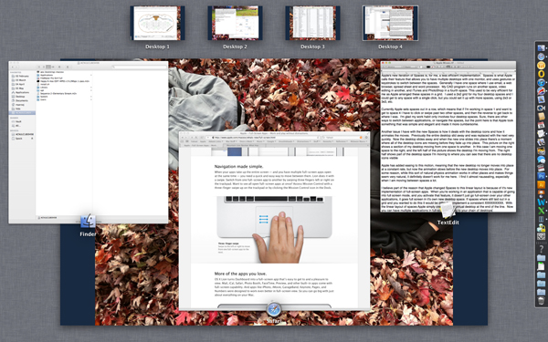
Apple is again preparing to update their desktop operating system, adding new features and functionality while also rethinking and changing the fundamental ways we interact with our computers.
I look forward to these software updates, as they often bring many great things to the Mac platform. One of my favorite new conventions is Natural Scrolling that was implemented with last year’s OS update. When I first heard about this I realized how much sense it made, especially with Apple’s two finger scrolling on their trackpads. Because I knew that I would eventually upgrade to the new OS and I wanted to get used to the new scrolling norm, I downloaded Scrollvetica, a small application that enabled natural (reverse) scrolling on my mac. While it took about a week before I didn’t have to think about which way I was scrolling and was naturally pushing the content in the direction I wanted it, I realized immediately that this was the proper way to do it. I believe Microsoft’s Windows 8 operating system will have Natural Scrolling built in as well, though I think it won’t be turned on by default, as it is in Apple’s OS, but will instead be an option the user can choose.
But other things Apple has been doing in their OS lately has bothered me. Natural Scrolling is part of their larger Gestures interface, which gives the user more control of their computer using multi-touch technology on their trackpads. I think Gestures are great, and have been using them for several years, but some of the ways it is implemented in the current OS are frustrating. Admittedly, some of my frustration has to do with the fact that some of the gestures I used for certain things changed, and I’ve found it hard to adjust to the new gesture as it seems less natural for me. But, I’m also pretty adept at adjusting to new things (I can use mouse, trackpad, or trackball equally well), so for me to find it difficult to adjust, I think, says something. Previously, in Apple’s Expose, the gesture to clear all windows off of the desktop was four fingers pushing up. When you did this, all of the windows would move up and away to either side of the screen. I equated this gesture with flicking the items out of my way. To bring the windows back, I pulled down with four fingers. To get to Widgets from the desktop the gesture was to pull down with four fingers, and then to dismiss them, four fingers up again.
Now the gesture of pushing four fingers up shrinks the desktop and pulls down a view of the desktop spaces, making the items on the screen move in the opposite direction of the gesture. Pulling down with four fingers reveals at the bottom of the screen all open windows for the active application. These gestures now seem less natural than the previous incarnation. Additionally, when the original gestures where first implemented, the commands they were controlling also had dedicated function keys on the keyboard that enacted the same behavior. Many of these keys have now been remapped to perform other functions meaning that a new user now needs to learn either the gesture or the new keystrokes (Command + Arrow) to be able to use these features. Judging by how many people I know who still don’t use keyboard shortcuts for such basic as Save, Quit, Copy and Paste, I suspect few people will be getting all of the benefits the Mac OS has to offer.
And this gets to, I think, a bigger problem for Apple. While I think gestures are cool and a great time saver, they aren’t completely obvious for a new user. Certainly you don’t need to know gestures to use a Mac, but without the dedicated keys you miss some of the functionality if you do not know the gestures. This is starting to happen with some of their other software as Apple is beginning to hide some basic functions and options making it difficult for a new user to acclimate to the OS, and possibly frustrating these new users.
 One example of this is in the sidebar windows of some Apple software, such as the Finder, iPhoto and iTunes. Older versions of the software had a triangle next to section headings in the sidebars that you could click to show or hide the contents under each heading. This is a convention that has been pretty standard across computer interfaces for years, and that Apple still uses to reveal nested contents when viewing folders in list mode.
The current versions of Apple’s software that uses a sidebar now has a hidden button to show or hide the contents of these section headings that the user has to discover.
As you can see in this picture above, on the left is what looks like an empty list of Playlists with no indication that there might be some content contained under that heading, and on the right, when the pointer is lined up with the section heading, the word ‘show’ appears. When the playlists are visible, the word ‘hide’ appears when the pointer is in line with the heading. I discovered this functionality quite by accident and after a brief moment of panic when it appeared that all of my playlists had disappeared.
Another new technology that Apple has rolled out is their iCloud. I think, in principal, that this is a great new feature. Right now I am using it to keep my address book synched between our home computer and our phones. Before iCloud, my wife and I were always trying to figure out which contact information for people was the most recent. Now when one of us updates someone’s information it syncs across all of our devices. Fantastic.
What I don’t like about iCloud is how it wants to treat music and photos. I may be in the minority here, but I don’t want my phone filling up with all of my music from iTunes, or music I’ve purchased. Additionally, since Apple’s free iCloud allotment is 5 GB, I don’t want or need that filled with music when I may want to use the space for other items.
Photo Stream is what Apple calls the feature of having your pictures sync across all of your devices. I think the idea of having photos I’ve taken move from my phone to my home computer through the cloud is great, but not every single picture I or my wife take. I tend to take many more photos than I’ll actually want to keep. Sometimes for fun, sometimes for work. Currently there’s no way to determine which photos get synched when using Photo Stream – they all go. I would prefer a system where I can pick which photos I want to have synched across all devices. I don’t think my wife is interested in having set construction photos on her phone when my intention is to load them on my work computer as part of a job record. Nor do I need every blurry photo my daughter takes showing up on my phone and filling my computer hard drive. Apple needs to make a way for us to choose which photos go to the cloud, and it should default to ‘none’ until we select otherwise.
Apple’s new iteration of Spaces is, for me, a less efficient implementation of what was once a great time saver. Spaces is what Apple calls their feature that allows you to have multiple desktops with one monitor, and uses gestures or keystrokes to switch between the Spaces. Generally I have one space where I use email, a web browser, spread sheet and word processor. My CAD program runs on another space, video editing in another, and iTunes and PhotoShop in a fourth space. This used to be very efficient for me as Apple arranged these spaces in a grid. I used a 2×2 grid for my four desktop spaces and I could get to any space with a single click, but you could set it up with more spaces, using 2×3 or 3×3, etc.
 Apple has now rolled Spaces into their Mission Control scheme, which includes Dashboard and Exposé, and now sets the desktop spaces out in a row. This means that if I’m working in space 1 and want to get to space 4 I have to click or swipe past two other spaces, and then the reverse to get back to where I was. I’m glad my work habit only involves four desktop spaces. Sure, there are other ways to switch between applications, or navigate the spaces, but the point here is that Apple took something that was simple and elegant and made it more cumbersome.
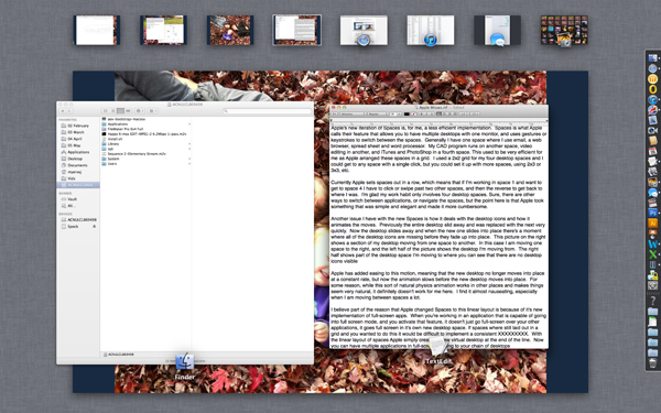
Another issue I have with the new Spaces is how it deals with the desktop icons and how it animates the moves. Previously the entire desktop slid away and was replaced with the next very quickly. Now the desktop slides away and when the new one slides into place there’s a moment where all of the desktop icons are missing before they fade up into place. This picture on the right shows a section of my desktop moving from one space to another. In this case I am moving one space to the right, and the left half of the picture shows the desktop I’m moving from. The right half shows part of the desktop space I’m moving to where you can see that there are no desktop icons visible – trust me, I have icons down the left side of my desktop.


